Tips for Optimizing Your App Paywall
Lessons learned from reviewing developers' paywalls
Hi, I’m Zach — I’ve built my app business to about $4m in annual recurring revenue. Building a successful app business is really hard. That’s why I write a weekly newsletter about the things I’ve learned along the way. My goal is to help you grow your business and profit. If you want to learn more about the app business, I highly recommend subscribing.
Paywall Webinar
Jake Mor and I hosted a webinar where we reviewed developer’s paywalls and thought of actionable tips for improving them. As we went through the paywalls, we noticed some common mistakes and trends that were popping up over and over again. Below, I’ll touch on just a few of the things that stood out to us.
If you’re interested in signing up for our next webinar which will be on Tuesday, December 22nd at 4:30pm EST, tap the button below.
Have a Clear Call to Action at the Top
When users hit your paywall for the first time, what do you want them to do? Of the paywalls we looked at, many did not have a clear call to action. Do you want the user to upgrade? To subscribe? If so, tell them that:
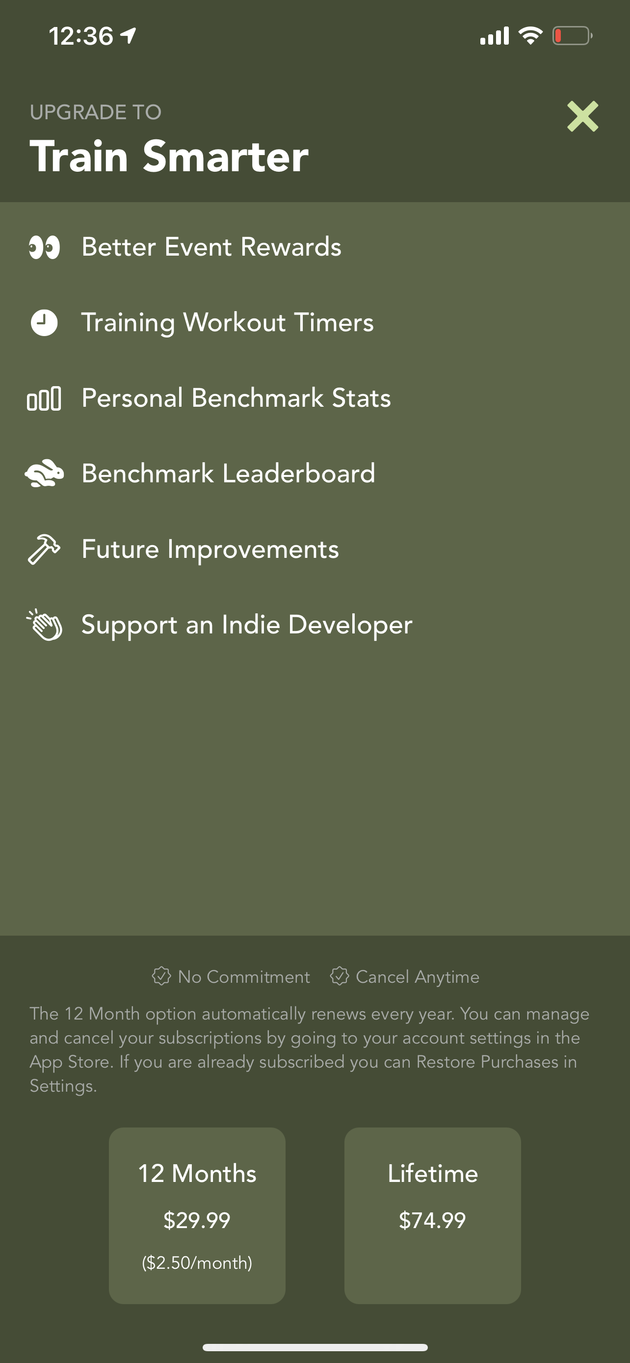
Good - "Upgrade To Premium” - “Upgrade To Train Smarter”
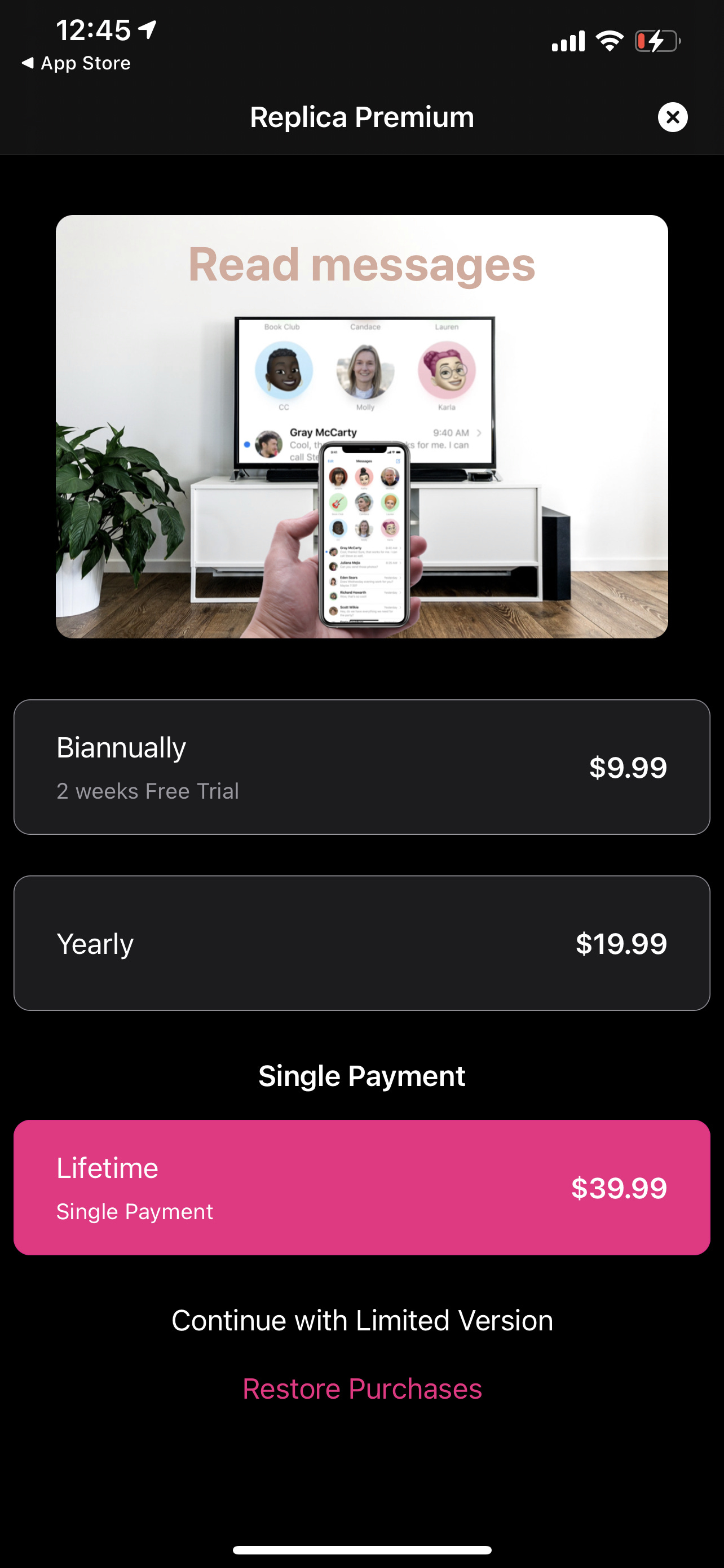
Unclear - “SongSheet Pro” - “Replica Premium”
It should be abundantly clear to the user what you want them to do.
Understand What You Are Implying
When you say “Upgrade to Premium” or “Upgrade to Pro” - you are clearly telling users that there is a free tier and a premium tier for your product. Alternatively, you can be a bit more vague and say something like “Subscribe to get the best of {app name}” or “Subscribe to Continue”. By doing this, you are changing the perception of your product to your users and may end up getting more paying users.
Don’t Assume Users Know Your Product
In many of the paywalls we viewed, the text and bullet points trying to convince the user to purchase assumed an advanced understanding of the product. Keep in mind that when most users see your paywall, they aren’t intimately familiar with your product. Rather than just describing the benefits of the premium tier of your product, explain the benefits of your whole product.
I.e. for Hashtag Expert, it’d be better for me to write:
Good: “Grow your Instagram profile with personalized hashtag recommendations designed to increase your reach”
Bad: “Get access to all hashtag generation algorithms”
This Post is Sponsored by Braavo
Huge thanks to Braavo for supporting this blog post and our webinar. Sponsoring partners enable me to spend more time writing helpful tips here and I really appreciate their generosity in offering to do so. I’m also glad they reached out because I actually think Braavo is a really fascinating tool to have in your app developer toolbox.
One of the biggest problems I dealt with as I scaled my business was cashflow. Apple routinely takes their sweet time to pay us—up to 40 days after the end of the month. January revenue doesn’t get deposited until March, but what happens if you have invoices due in February? That big delay in payment can actually have a major impact on your business growth if you’re scaling your revenue quickly via ads or other channels.
Braavo will hook up to your App Store Connect account, see how much you’re getting paid, and give you instant access to that money for a small fee. You can access as little or as much money as you want from Braavo and you only pay for what you take. As you scale, Braavo also offers a revenue-based funding product that provides up-front cash for UA in exchange for a share of future earnings. Combined, these funding options can be super powerful if you’re trying to grow your business without giving up too much equity. It’s flexible, fast, and convenient.
Over the past few years, I’ve seen Braavo continue to focus on building a broader and more powerful financial tool kit for app developers. The truth is, us app makers emphasize developer tools a lot but often forget about financial tools which are the engines of our business growth—everything is a function of money and cash flow. I highly recommend taking a look at their suite of products as they are specifically designed to help developers make more money. Thanks again Braavo! Use the promo code shakd25off to get 25% discount for 12 months when signing up for their Analytics.
Make it Clear That There’s a Paid Tier for Your App
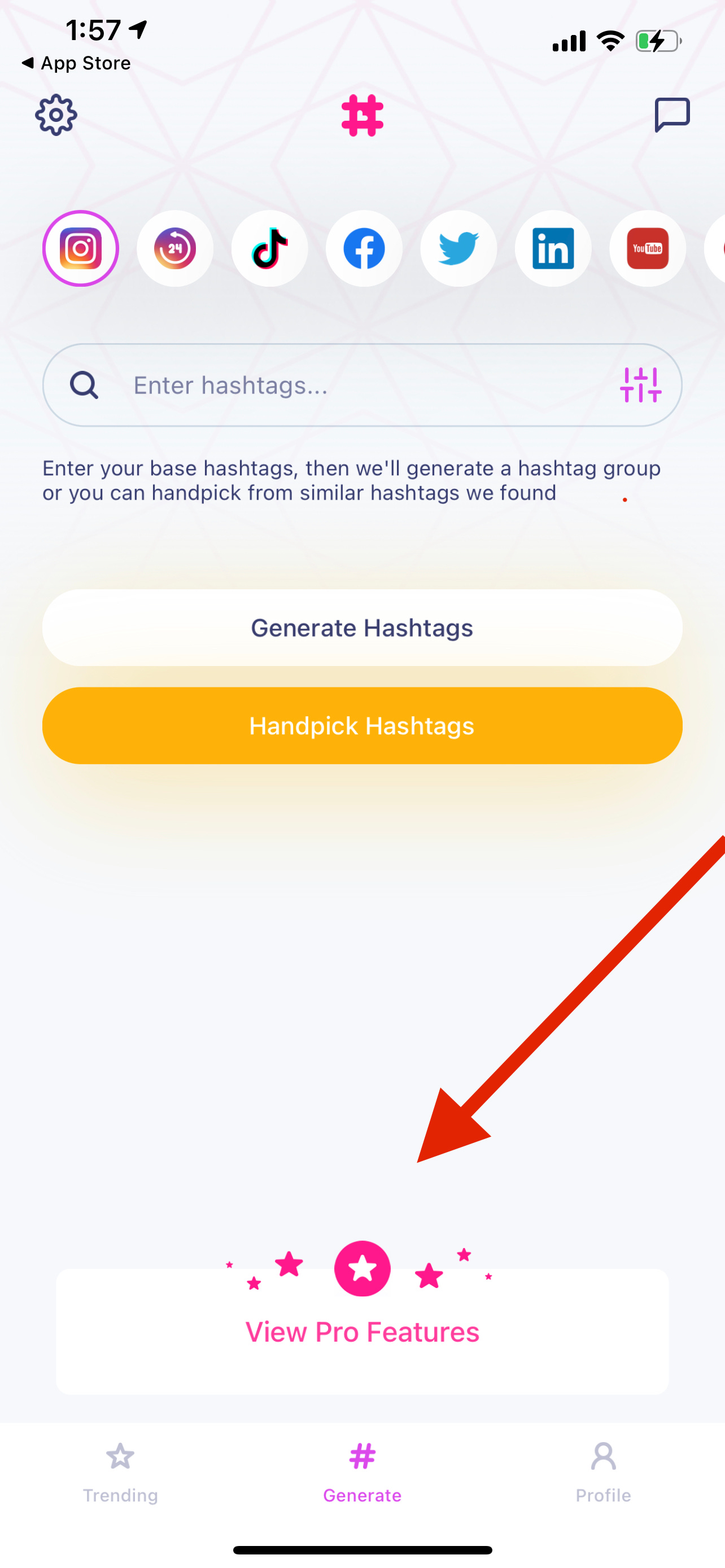
In a few of the apps we tested, we actually had trouble locating the paid tier. It should be abundantly clear to your users that there is indeed a premium tier for your app. If I want to subscribe their should be a button available almost at all times for me to upgrade. Consider putting a banner on the bottom or top of your main app screen like so:
Using Thoughtful Grammar and Copy
If you’re not an expert at copywriting, it might make sense to hire a professional copywriter to edit the text in your paywall. Here, I specifically mean grammar, punctuation, and spelling. It’s essential you get these right and a slight mistake can make your paywall instantly go from professional to unprofessional. Hiring a copywriter is a fixed cost and I highly recommend at least having one proofread your work.
Leveraging Color to Emphasize Actions
We noticed that some of the paywalls had similar color patterns in their action buttons. For example, consider this one:
Notice how the background colors on the “12 Months $29.99” and the above sections with bullets “Better Event Rewards”, “Training Workout Timers” are all in the same color scheme? This can be confusing to the user. It’s not clear that the pricings at the bottom are even buttons. This falls into the category of user experience (UX), but it something essential to keep in mind while working on your paywalls. Use color to emphasize what you want the user to do.
On the other hand, notice where you eye naturally goes when you see this paywall. Immediately, the Lifetime purchase button captures your attention. This makes it clear that this element is in fact a button and it’s the button I’m most likely to press.
View The Full Webinar
What Should I Write About Next?
What’d you think about this post? Did you find it useful? Make sure you click one of the links below to leave me some feedback and vote on what I should write about next:
Paywall Analysis Part 2 - More Ideas for Improving Paywalls
Creative - How to Think About Creative for Paid Marketing
Year in Review - Lessons I’ve Learned This Year From My App Business
College - The Inconvenient Truth About Dropping Out
This blog is very much a product of you, the reader. If you want to learn how to build a profitable app business, I highly recommend subscribing. I also like to ask readers to proofread my articles and offer criticism so make sure you’re following me on Twitter. Until then, have a great week!
Interested in sponsoring this newsletter? Fill out this form and I’ll be in touch:


